
My Medic
UI/UX and Graphic Design
Project Overview
My Medic is an online platform offering virtual consultations with doctors and the convenience of purchasing medicines online. Recognizing the growing trend of people turning to online consultations initially, our app aims to address the potential issue of misdiagnosis. By enabling users to consult online and eliminating the need to physically purchase medicine when unwell, My Medic enhances convenience and minimizes the risk of misdiagnoses. We cater to those who prefer resting when feeling unwell, just like visiting your neighborhood doctor.
My Role
UX designer leading my medic website and app design.
-Conducting interviews
-Creating paper and digital wireframing
-Developing Low and high-fidelity prototypes
-Conducting usability studies
-Ensuring accessibility
-Iterating on designs and responsive design
The Problem
Access real-time online consultations with licensed doctors and seamlessly acquire prescribed medicine through convenient online purchasing – all at your fingertips.
The Goal
Addressing the issue of patient misdiagnosis through online self-searching, our service offers a solution. Receive accurate diagnoses from professionals and conveniently obtain prescribed medicine online, similar to the ease of ordering through food delivery services like Grab.
.png)
Understanding The User
User Research: Summary
"I conducted user interviews and turned the insights into empathy maps to gain a deeper understanding of our target users and their needs. It emerged that a significant number of users tend to seek information online before consulting a doctor, some people observe their illness for a while before going to the doctor, and some diseases are detected too late. Additionally, some users may have expired medicine due to fatigue from driving to buy the medicine."
User Research: Pain Points
1: Finding and booking a doctor is time-consuming. Users just wants more time to rest when sick.
2: Seriously ill people who live alone often lack the energy to drive to get their meds.
3: For some users, it’s embarrassing to ask certain health questions, they might lookup online before they decide to see a doctor.
4: It's hard to find parking in city areas (e.g., KL, Malaysia).
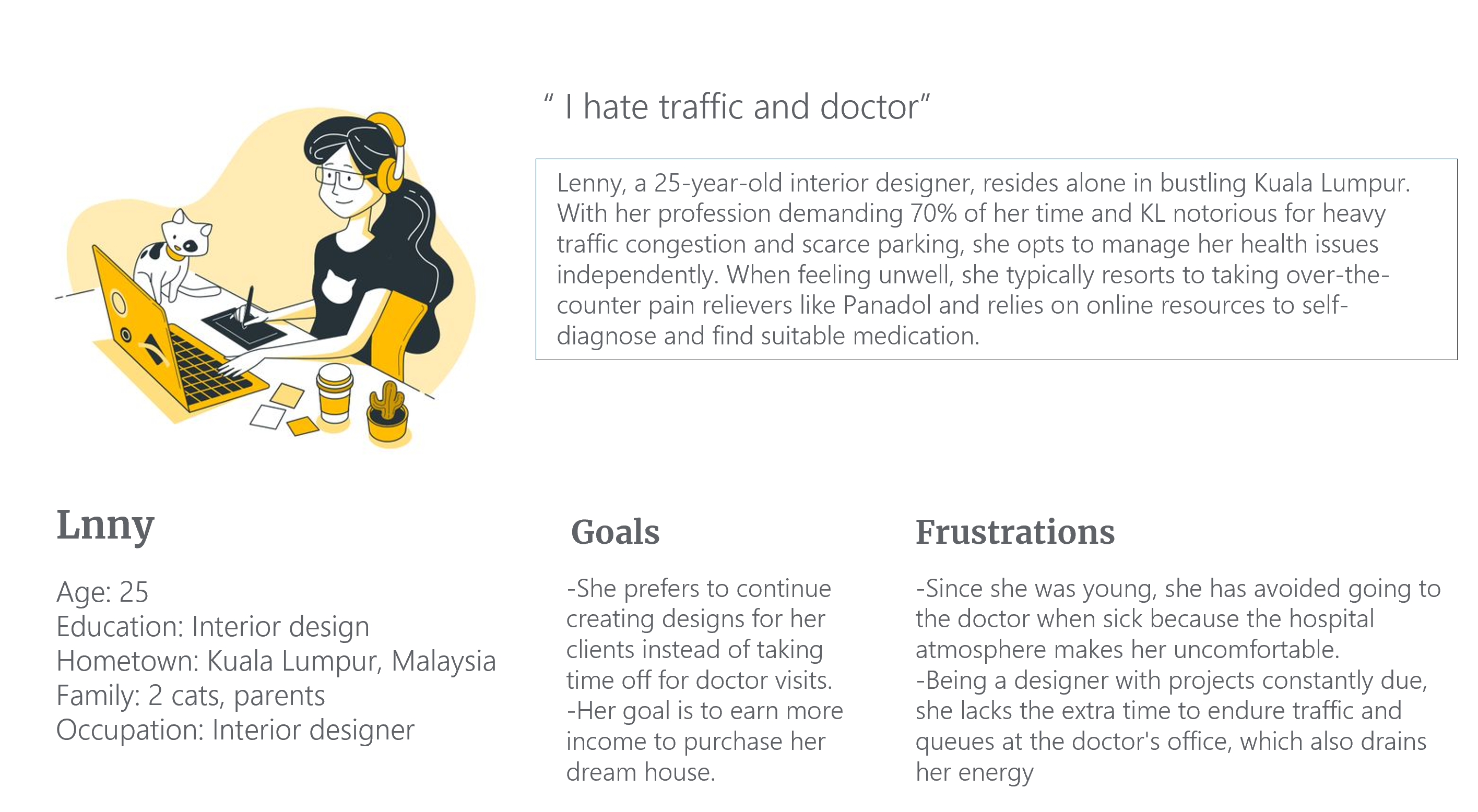
Persona: Lnny
Problem Statement:
Lenny is a female interior designer who lives alone in the bustling center of Kuala Lumpur. When she is sick, she prefers not to visit the doctor and administers medicine to herself, as she perceives visiting the doctor as a waste of energy.
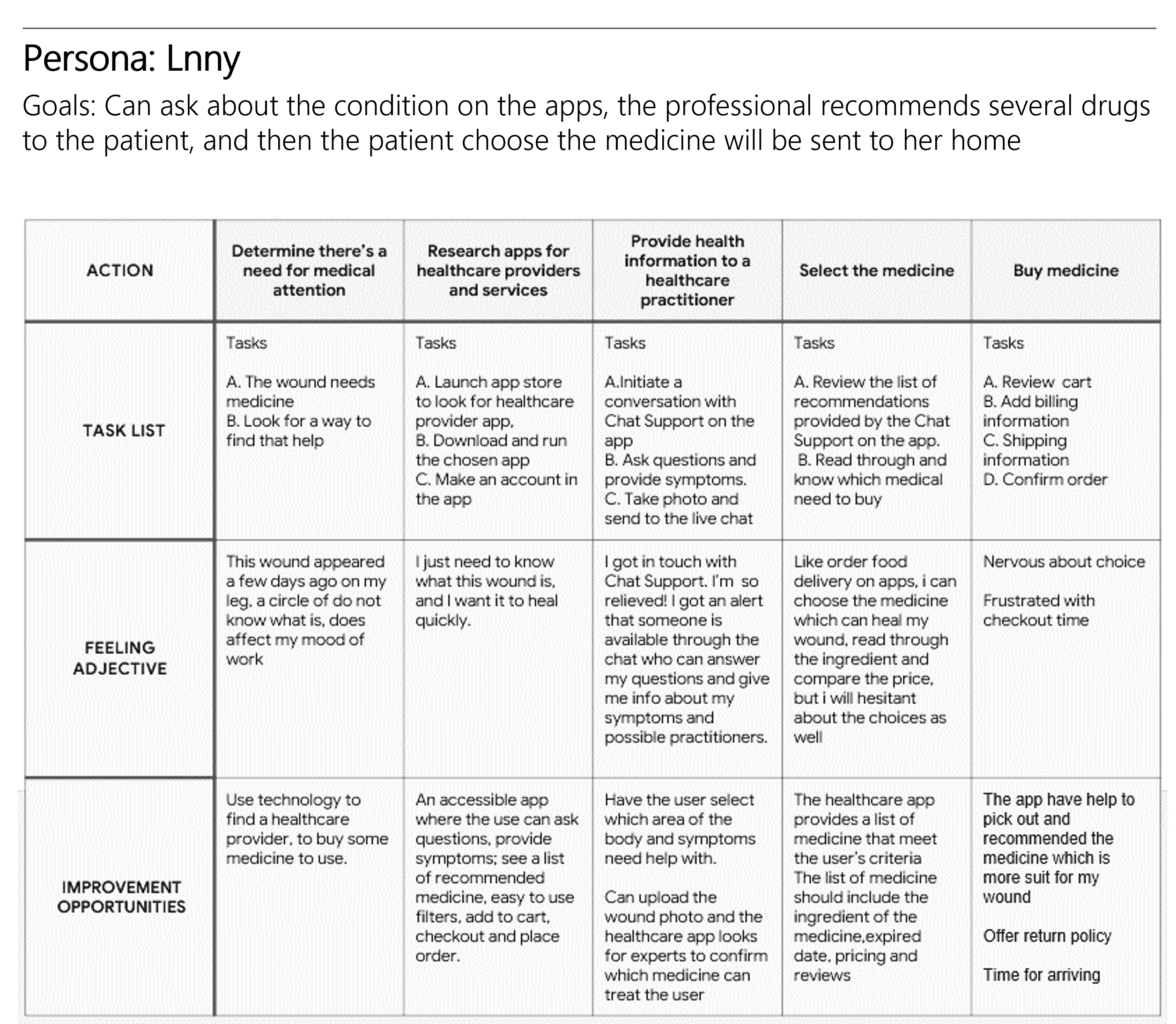
User Journey Map
By creating user journey maps, I aimed to illustrate how Lnny behaves, feels, and thinks while accomplishing her goals, addressing pain points, or providing moments of delight.
Starting The Design
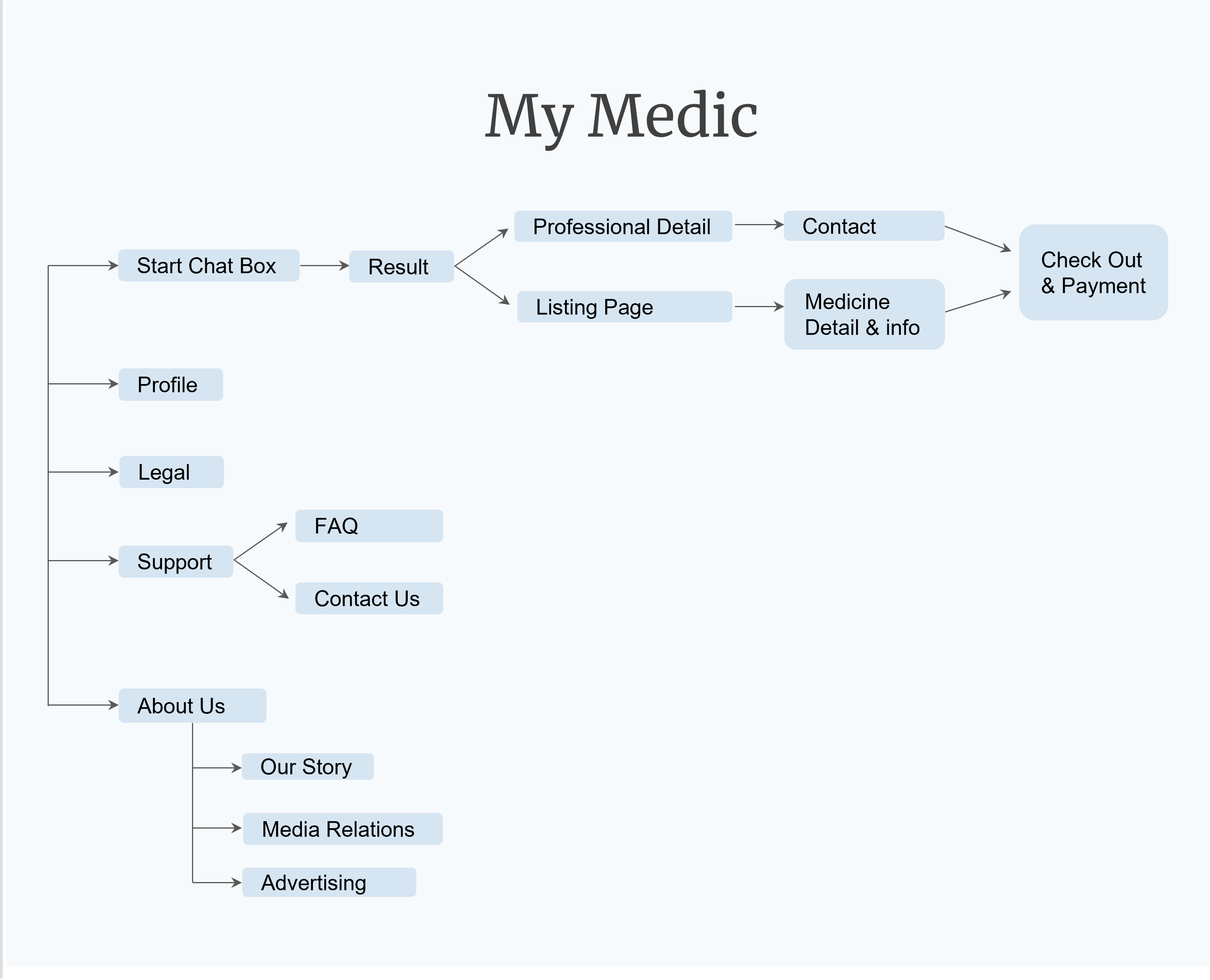
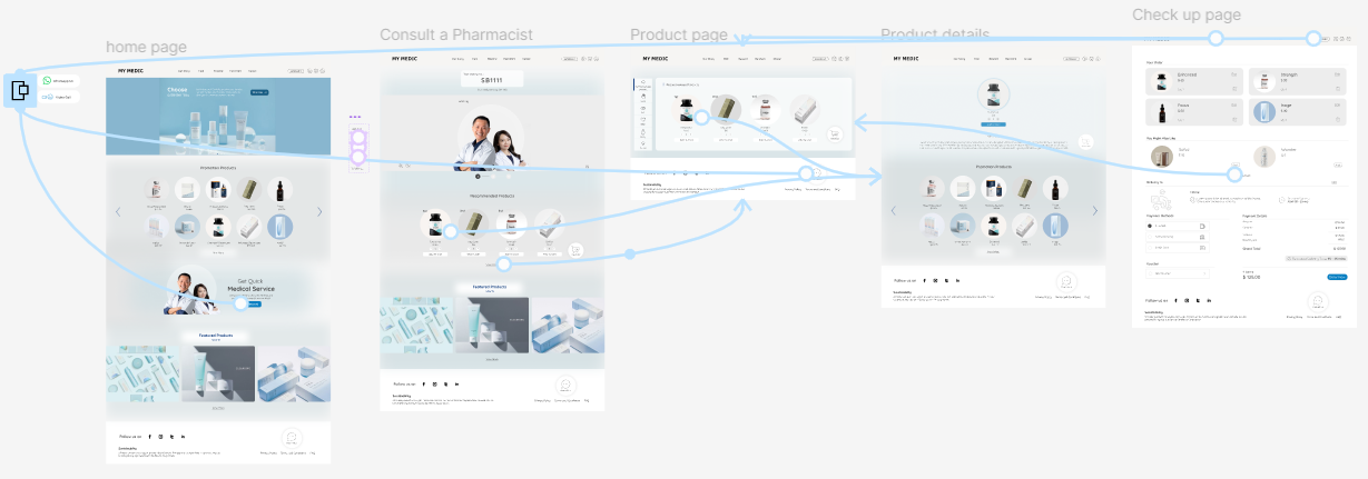
Sitemap
I built user-focused flows to ensure that my personas could successfully complete their key objectives while reducing any existing pain points.
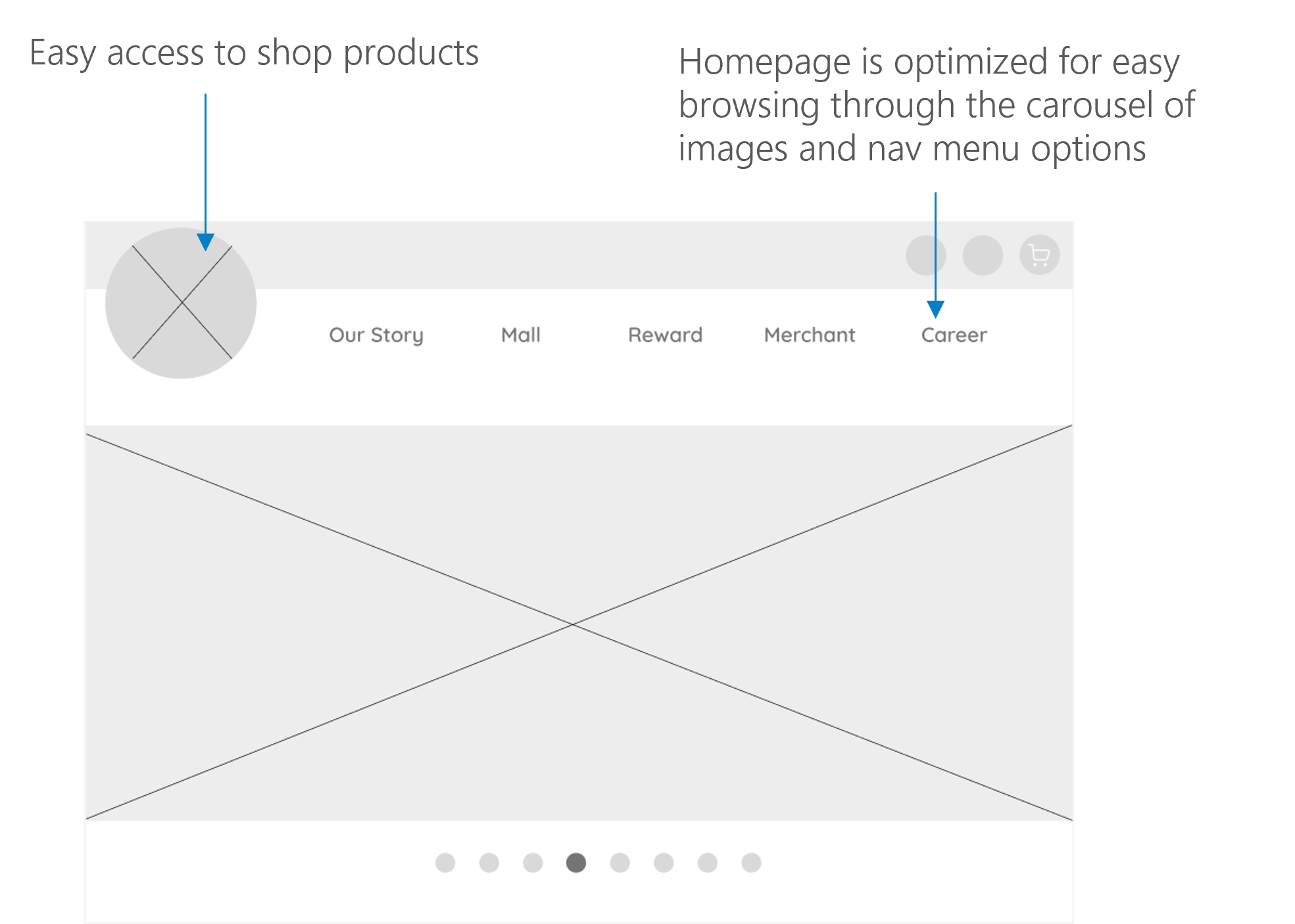
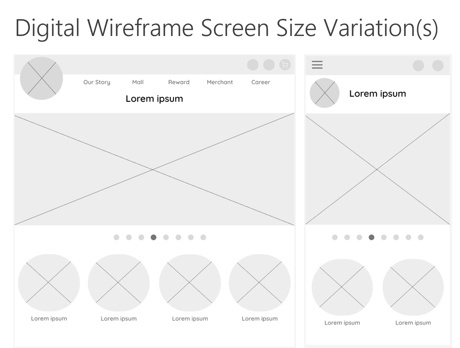
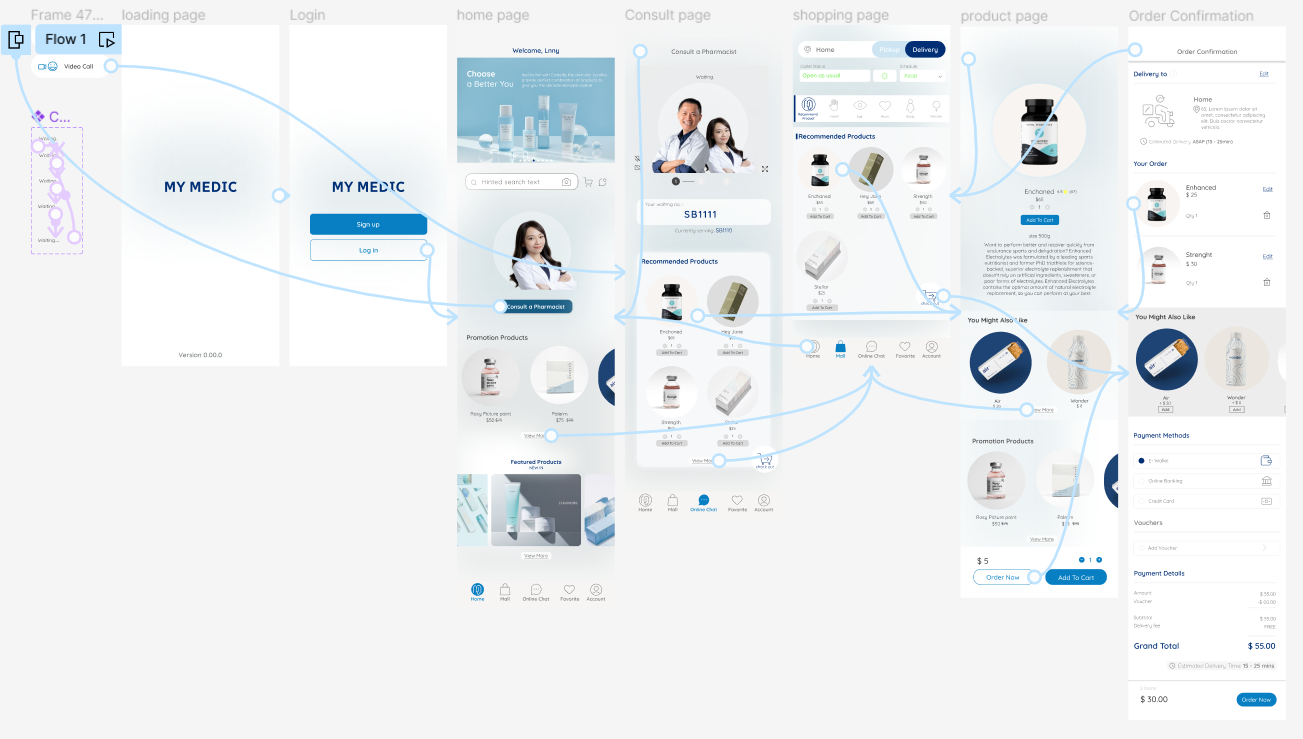
Digital Wireframes
To create digital wireframes, I started by sketching my ideas on paper. Then I worked on high-fidelity wireframes in Figma. After several iterations, I developed these wireframes.
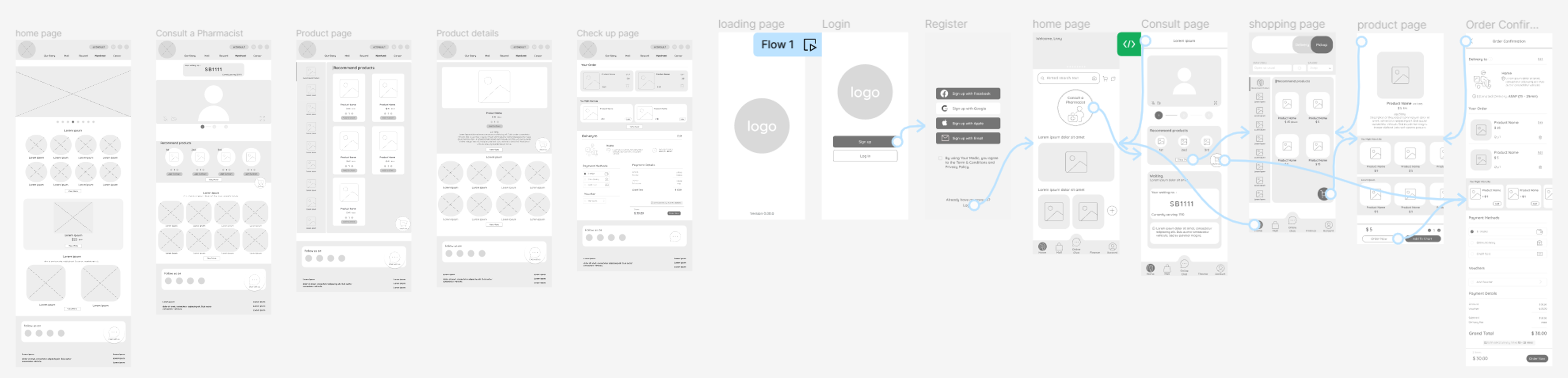
Low-Fidelity Prototype
I created a low-fidelity prototype from the user flow diagram and wireframes to test functionality before incorporating it into the final design and to ensure accessibility for end-users.
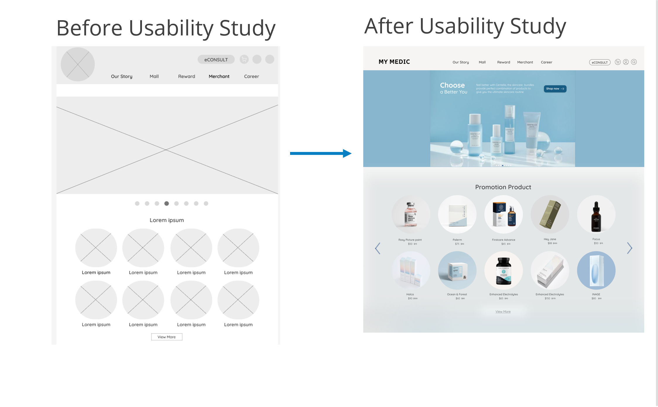
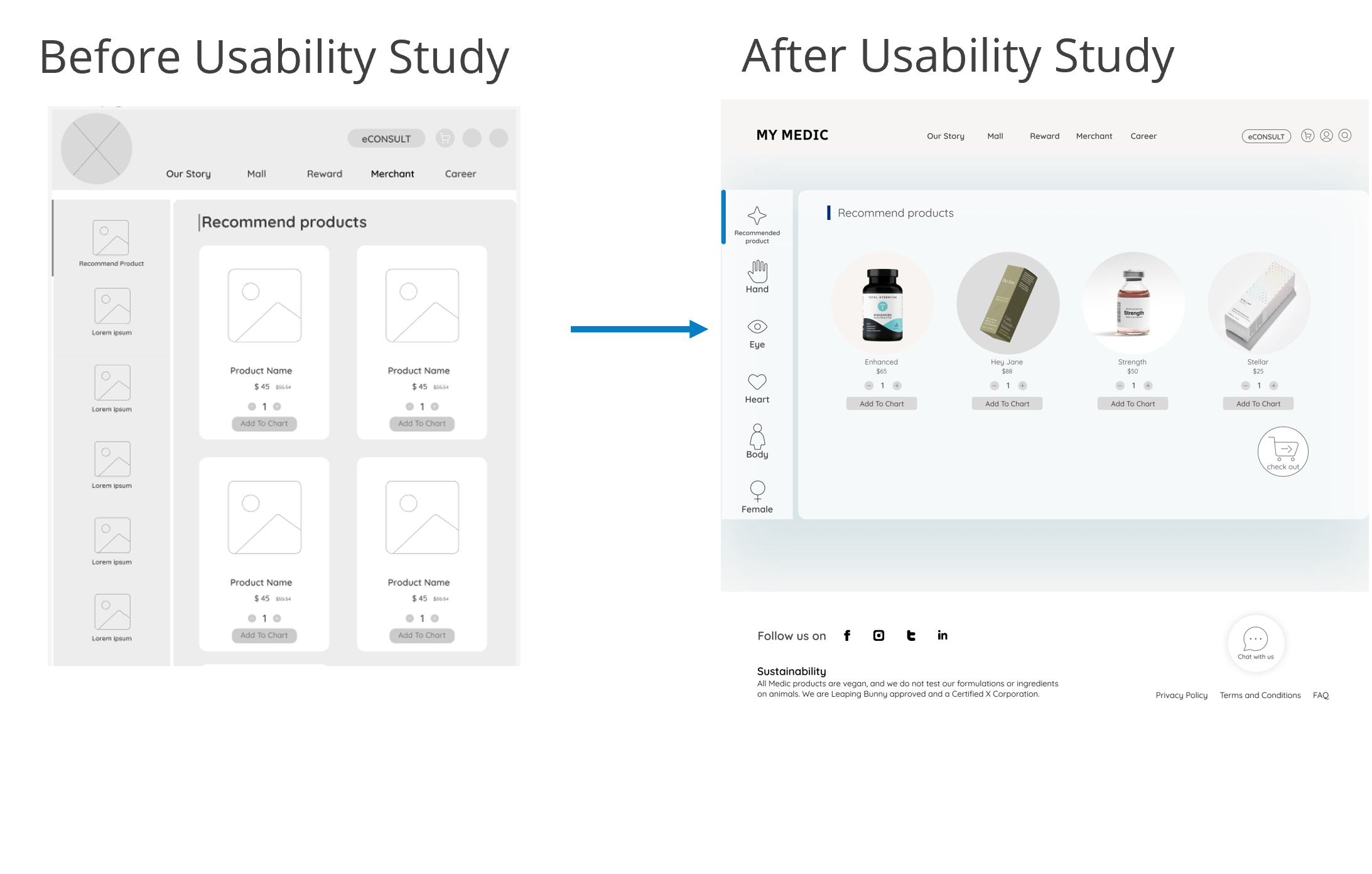
Usability Study: Findings
Now that I have the key insights from the usability study, let's look at the findings and define the actual problems that a designer can solve.
1. The app lacked filtering. Details missing: Filter capability, specific words chosen.
2. The website design overall was too large, especially the text.
3. The online consult screen needs to provide more details for users to consult online. Details missing: languages spoken, waiting time.
Refining The Design
Mockups
Mockups: Original Screen Size
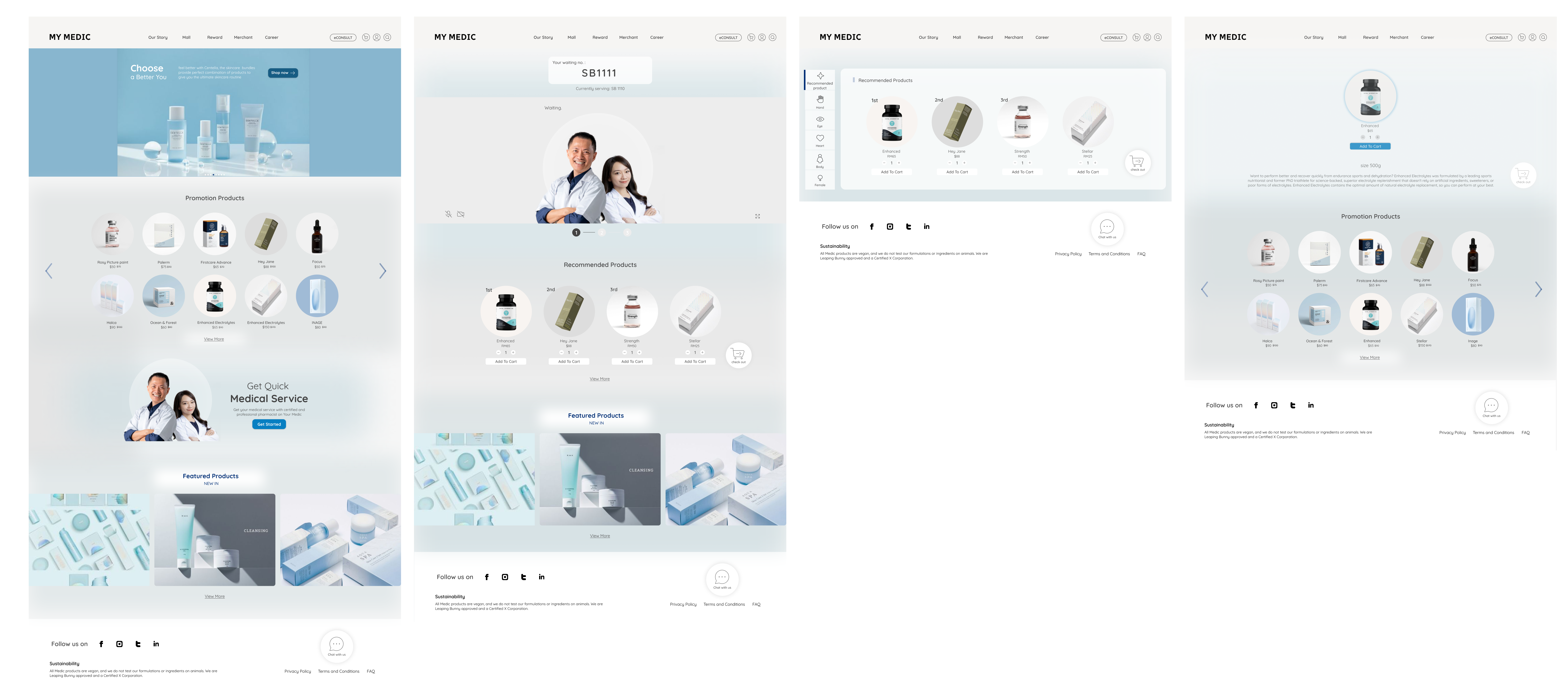
Mockups: Screen Size Variations
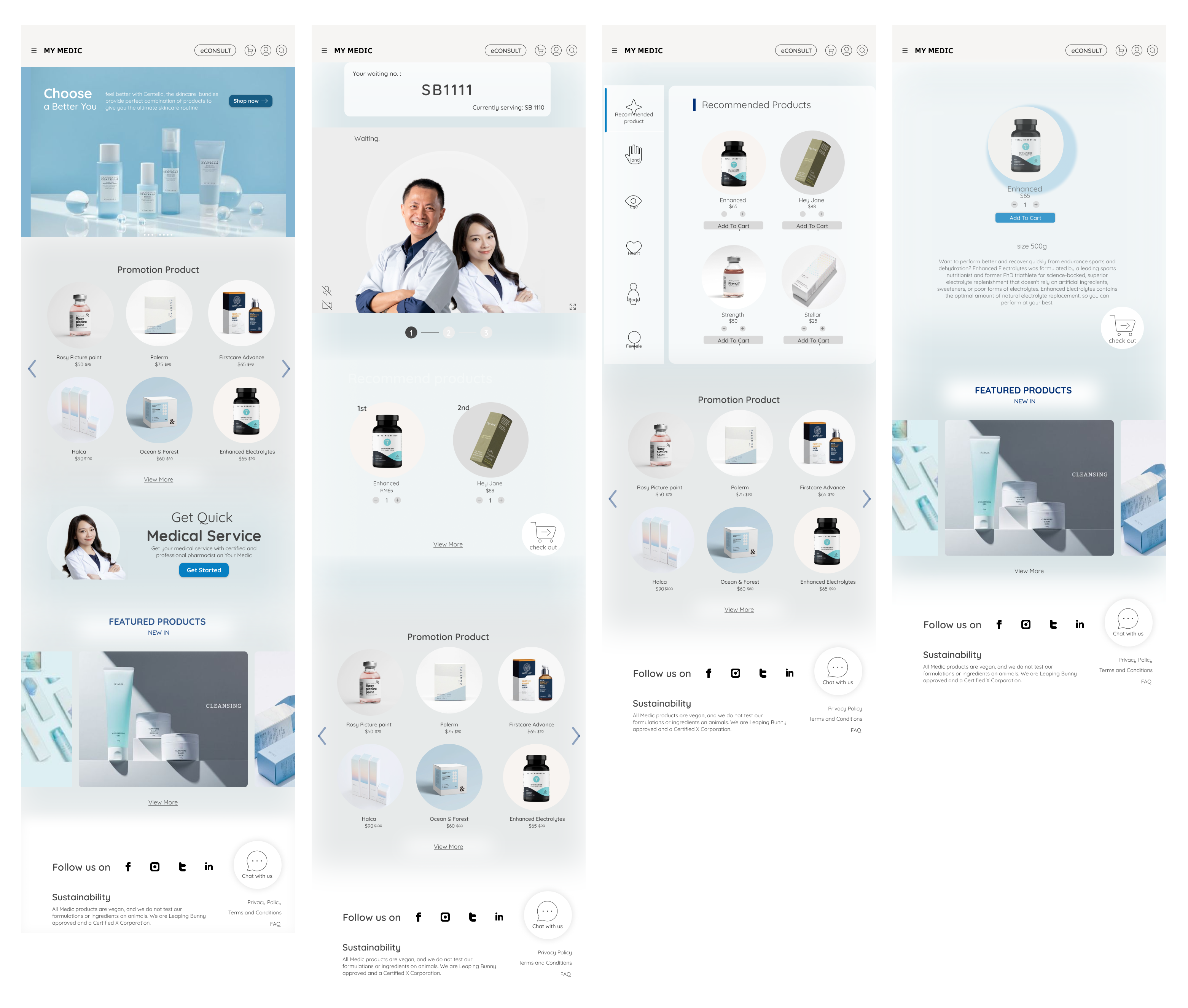
High-Fidelity Prototype
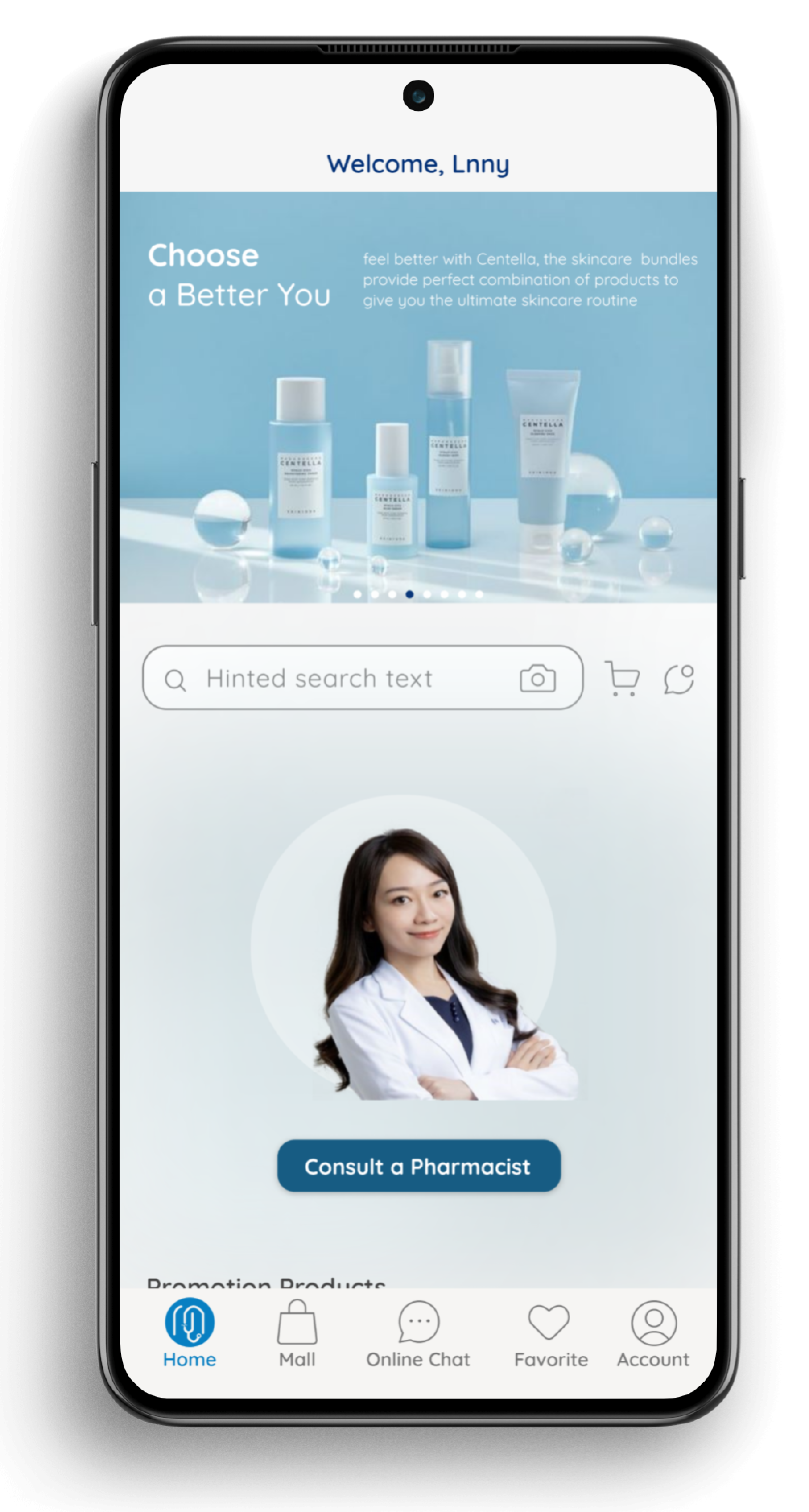
After finalizing the low-fidelity wireframes, I created the final designs with the goal of making them simple and intuitive. The main color theme I used was blue to evoke a sense of trust in the users.
Accessibility Considerations
1. When choosing a color palette, I made sure my primary colors met WCAG AA Compliance before building out the UI for each screen.
2. I am using only one type of font so it is easy to read. Mixing too many different typefaces can make your app seem fragmented and make it difficult for the user to know where to look.
3. I use different shades of color throughout the app. This helps users distinguish between different sections and information on the screen.
Going Forward
Takeaways
Impact: Our target users shared that the design was intuitive to navigate, more engaging with the images, and demonstrated a clear visual hierarchy.
What I learned: As a UX designer working on a healthcare platform, I have gained valuable insights and knowledge through the design process. Some of the key things I have learned include understanding user needs, the importance of simplicity, accessibility considerations, user feedback, and Figma.
Next Steps
1. Obtain UX/UI feedback from designers with more experience in the field to improve design.
2.Document all feedback provided and make necessary design updates to improve the app’s overall experience.
3. Create a cross-platform responsive design to ensure a consistent experience for all users, regardless of the device they are using.
.png)
View Hi-Fi Prototype